For a long time Adobe Photoshop was the go-to-tool for UI/UX designers. This was not through choice but more out of necessity as there were few professional tools available. However, over the years a number of tools have entered the market.
Wireframes, Prototypes and Mockups
Many clients get confused about the difference between wireframing, prototyping and mockups. Each one not only look very different, they also serve very different purposes. Depending on the type and size of the project, you may need all three or just the ones you feel are necessary.
So what are the differences?
Wireframes
A wireframe is a static, low-fidelity representation of a website. They are the first step in the design process. Their simplicity allows you to focus on the bigger picture - the layout, visual hierarchy and page functionality. Wireframes are quick, cheap and easy to create, as well as being easy for clients to understand and digest.
Mockups
Where wireframes are the skeleton of a website, mockups are the skin. They are visual representations using real graphics, colours and typography. They look like the final product but without any interactivity. Mockups are useful for gaining visual approval.
Prototypes
An interactive representation of a website is called a prototype. They can be both visually rich and simple. They give clients an idea of how the final product is going to look and function. Prototypes are great for reviewing and can help identify minor issues in the design or UX process.
With client expectations increasing, many agencies produce prototypes to give a better understanding of what they intend to deliver. With more prototyping tools on the market, its not surprising many designers are confused about which one to choose?
So which UI/UX design tool should you be using? To help, here are our 5 top UI/UX tools.
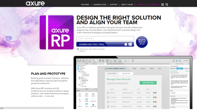
Around since 2002, Axure is the original wire framing and prototyping tool. Whether you need quick mockup or produce a polished product, Axure can do it all. It has an endless array of great features that are with exploring. "Shared projects" enables teams to collaborate on the same project.
However, axure isn't the easiest of tools to learn, its not a simple drag and drop tool like Webflow. Simple interactions and animations can be quite complex and time-consuming. Axure has a wide online community that offers support and advice.
It is well worth taking the time out to learn Axure, it can be a very powerful tool.
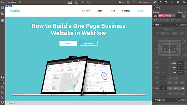
If you are a freelance designer, or have no prior knowledge of coding, then Webflow may be the tool for you. It requires no coding skills whatsoever; you simply drag and drop components. Once complete, you can export the HTML/CSS or convert it into a production ready site with one click. Users will find the interface very similar to Adobe Photoshop, with toolbars, panels and dropdowns.
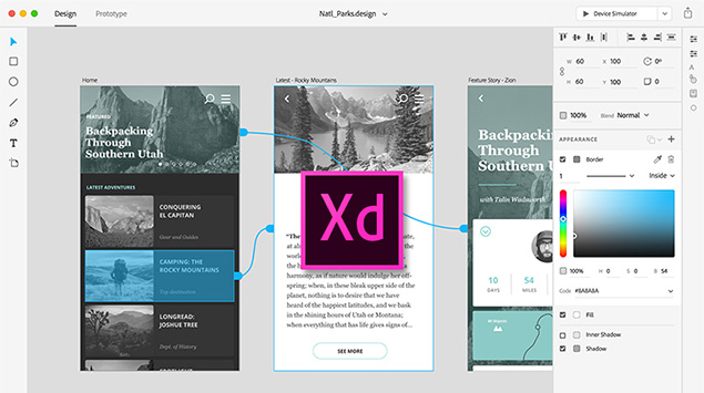
Released in 2016, XD is Adobe's answer to Sketch. It combines the design tools of Sketch, with the prototyping features of Invision. The interface is minimal, consisting of icons and get tones, with the most common actions available in just a few clicks. XD has the benefit of being part of Adobe CC and therefore compatible with other Adobe products.
One of my favourite features is being able to switch between design and prototyping mode. At any point you can create and share interactive prototypes with other members of the team or clients.
Its worth keeping an eye on XD, as its relatively new to the scene, with Adobe planning on making some big improvements.
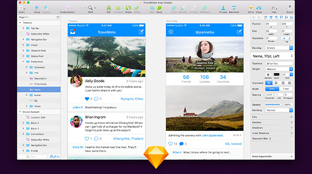
Since its release in 2010, Sketch has taken the UI/UX design world by storm. A growing number of UI/UX designers felt Adobe Photoshop was old and insufficient. Many started to look for an alternative, which led them to Sketch. A vector based design tool built by the Bohemian Code team. Designed with UI/UX in mind, Sketch is both minimal and lightweight. At only $99, its an affordable alternative. Top agencies around the world use Sketch to help them produce stunning websites and apps.
Users will find Sketch easy to use. It shares many features and tools with Adobe Photoshop, like art boards, guides and symbols.
That being said, Sketch is not entirely perfect. Firstly, it is limited to Mac users. This exclusivity is something to consider, especially when it comes to team collaboration.
Secondly, Sketch needs plugins to survive. There are hundreds of plugins to choose from, with each claiming to improve your productivity. However, be aware the more you install the more you have to manage.
Lastly, Unlike Adobe XD, Sketch doesn't support any prototyping tools. Users will need to import their design files into Framer.
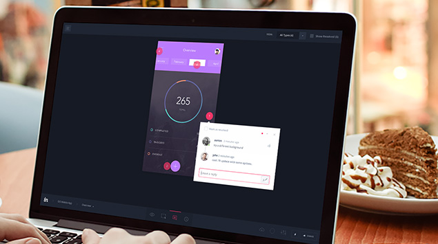
Invision is one of the most popular tools not he market. It is a reliable prototyping tool, with users uploading static designs and then adding hotspots, animations and gestures. Invasion is a great tool for project feedback and collaborating with clients. Users can leave comments directly onto the prototype, so you never lose track of feedback. The tool is simple to use, with no prior knowledge needed.
Unfortunately, Invisions transitions and animations are limited. You can use both hotspots and timeouts to move between screens.
Conclusion
What was once a market dominated by Adobe Photoshop has now become highly competitive. Choosing one product can be difficult, but its largely a matter of preference. Each one has its own strengths and weaknesses, so you just need to find one that meets you own needs, or those of your projects. Adobe Photoshop has served designers well, but now its time for us to use tools more suitable for UI/UX design. For me, theres not much to choose between Sketch or Adobe XD, but being a huge Adobe fan, I recommend XD. It may be less established out of the two, but it is the only true all-in-one UX tool available. Sketch relies too much on plugins for my liking, so XD has the edge. Its free to those who already subscribe to Adobe CC.
So why not give the various tools a try. It might change how you design your next website