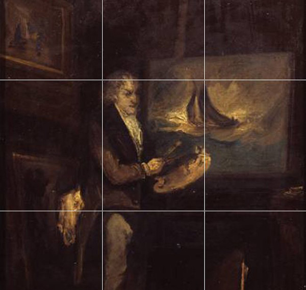
Whether its in art, architecture, film or design, the rule of thirds can be seen everywhere you look.
History of the rule of thirds
The rule of thirds is a composition technique that has been used by artists for more than 200 years. The term was first used by John Thomas Smith, an 18th-century painter, in his book called, Remarks on Rural Scenery. Smith acknowledges that through the use of grids, artists can create aesthetically pleasing compositions that capture the viewers attention.

What is the rule?
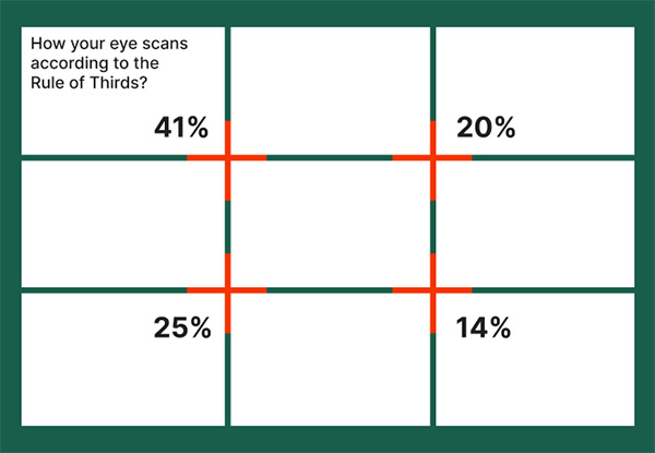
The rule involves dividing a composition into thirds, both horizontally and vertically. This creates nine equally sized quadrants and four intersecting areas called focal points, also known as sweet spots. The aim of the rule is to position the most important elements of a composition near the four sweet spots, as these are areas the viewer's eye is naturally drawn to.

The top left sweet spot is where the viewer's eye first scans, getting 41% of their attention. This is followed by the bottom left and top right getting 25% and 20% respectively. Lastly, the bottom right sweet spot gets the least attention, only getting 14%.
How is the rule used in UX and UI design?
There are many reasons why the rule of thirds is used by UX/UI designers.
01.Providing visual interest and balance
Firstly, the rule helps UX/UI designers create visually appealing layouts that are well balanced by evenly distributing key elements throughout a design. This keeps layouts organised and gives them a sense of depth which can make them memorable. It also creates harmony which allows users to navigate content effortlessly.
02.Capture attention
Additionally, the rule of thirds helps UX/UI designers to position key elements like headings, images and buttons in strategic places where the users eye is naturally drawn to. This not only captures the users attention but also keeps them focused on what matters most. This leads to a boost in user engagement as users are more likely to stay on a website or complete a task when they are less distracted.
03. Establishing visual hierarchy
The grid-like structure of the rule enables UX/UI designers to prioritise and divide content into clear groups. This keeps layouts organised and easy to understand. The four sweet spots ensure there is adequate spacing between elements, creating natural flow which helps users glide through the content with ease.
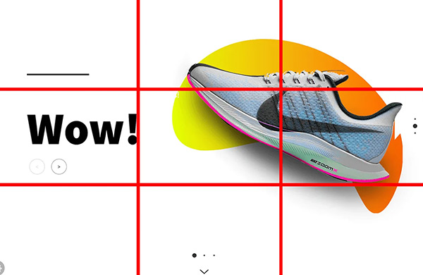
Exampe - Nike

Nike uses the rule of thirds to great effect. It is clear to see how they use the four sweet spots to effectively position either text, an image or a call to action button. This captures the users attention and helps to reinforce their message.
Key takeaways
The rule of thirds is a compositional technique that is often used by UX/UI designers to help create aesthetically pleasing and user-friendly layouts. By dividing a composition into nine equal parts it can provide balance, directs attention and create harmony. This helps users navigate through content more easily. The flexibility of the grid provides a solid foundation for websites to adapt across multiple screens with ease and consistency.
However, it's important to treat the rule more like a guideline that a stringent rule. Try not to rely on it entirely, as overuse can lead to layouts looking rigid and predictable. Also, avoid placing too many elements inside the same sweet spot. While these are meant to guide the users eye, overcrowding can cause confusion and can lead to users abandoning a website feeling frustrated. Tho, the rule provides a framework for layouts when viewed on larger screens, this is not the case when viewed on smaller screens, like mobile devices