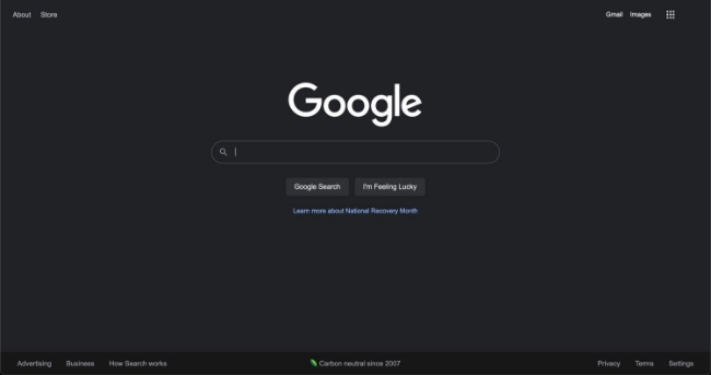
Look who's back! - Once used in the 70's and 80's, dark mode is a stylish and elegant design trend that is rapidly growing in popularity. Big companies like Facebook, Google and Apple have all jumped on the trend and offer it to their users. A recent study by Google revealed that "82% of android users prefer using dark mode on their devices".
So what is dark mode and why for its sudden resurgence?
What is dark mode
Dark mode, also known as night mode, is a low light user interface (UI) that uses dark colours as the primary background colour. It was first used back in the 70's and 80's out of necessity, to help reduce the power consumption and heat generation of computer screens. Think the opening credits of the sci-fi film, the Matrix; green text on a black background.
However, by the early 90's, dark mode soon faded out of popularity and was replaced with the lighter designs we commonly see today.
Some examples of dark mode


Benefits of dark mode
01. Easy on the eyes
The main advantage of dark mode is that it is easier on our eyes, particularly when used for long periods or at night. It reduces the amount of bright light emitted from our screens, which causes eye strain, fatigue and disrupts sleep.
02. Battery life
Another benefit of dark mode is the reduced power it uses, therefore saving on battery life. OLED monitors use less power when displaying darker colours. Although recent studies have shown that this might not be as much as Google first thought, in a world dependent on energy, every little helps.
03. Visually appealing
Dark mode is a bold and modern aesthetic that resonates with users. It has a sense of elegance and sophistication associated with it, whilst retaining a sense of intrigue and mystery. Brands may consider adopting a dark mode to ensure they stand out from the crowd and are remembered.
However, dark mode is not suitable for all brands. For example a healthcare brand would not adopt a dark mode approach when a light, white, approach is more appropriate. Instead, consider your users needs and preferences. If a dark mode approach is chosen, then UI designers must use a colour scheme that provides sufficient colour contrast and should consider using larger fonts to improve readability.
04. Increase conversions
By changing the colour of the background to a dark colour you not only reduce distractions but also direct the users attention towards the content. This makes for a more user centred experience which can lead to an increase in conversions.
Key takeaways
There are many reasons why dark mode should be offered to users. Firstly, dark mode reduces eye strain and improves accessibility for those using devices in low-lit environments or at night. Secondly, it removes any distractions caused by bright backgrounds, allowing users to focus on the content. This makes the experience more engaging and user focused. Aesthetically, dark mode is a powerful tool for adding a sense of elegance and making a brand remembered. It appeals to younger audiences and is becoming increasingly used on tech and gaming websites.
However, keep in mind that not all users like using dark mode, nor is it suitable for all brands to adopt. Instead, give users the option to switch via a toggle. By giving users the freedom to choose, you are empathize with their emotions and create a more personalised experience.