Named after the iconic boxed meal - Bento boxes are foods in various sized containers. The Bento grid is a design trend that is gaining popularity in UI design in 2024.
But what are they and where do they come from?
What is a Bento grid?
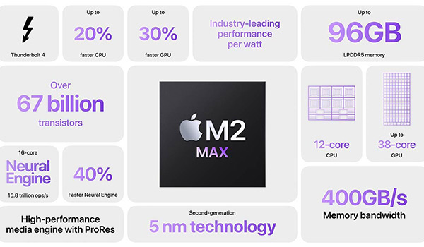
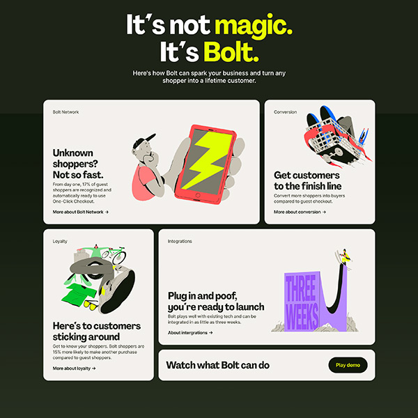
The Bento grid is different sized boxes arrange in a visual and dynamic layout. Each box is clearly defined and serves as a space to showcase a specific highlight or feature.
Where did it start?
This is an ongoing debate, with some arguing that it was Apple who first introduced Bento grids in their promotional videos. While others suggest it was Microsoft when they introduced the Windows 7 phone in their Metro design system.
Examples

Apple - uses a Bento grid in their promotional video to highlight the main features and specifications of their Apple Mac to viewers in a neat and eye-catching layout.

Hopscotch uses a Bento grid in a fun and creative way to showcase their client testimonials.

E-commerce platform, Bolt, use a Bento grid coupled with stylised illustrations to visualise their services.
Benefits of Bento grids
01. User friendly
Bento grids are user friendly because they show content in a clear and structured way. They remove any unnecessary distractions and confusion, keeping users focused on what really matters, the content.
02. Aesthetic appeal
Bento grids are popular amongst UI designers because they add visual appeal. These carefully arranged boxes have a modern look and feel, whilst their symmetry creates a sense of harmony that resonates with users.
03. Mobile friendly
A key feature of a Bento grid is its flexibility and adaptability to work across multiple screen sizes. They are built with responsiveness in mind. When viewed on a mobile device, the boxes of a Bento grid will simply stack on top of each other to form a single column. This makes them ideal for those designers wanting to ensure a consistent and user-friendly experience throughout
Key takeaways
Named after the iconic Japanese meal box, the Bento grid is a UI design trend that is taking 2024 by storm. These various sized boxes are user-friendly and visually appealing, whilst providing structure and add dynamism to layouts. Their flexibility makes them a popular choice for UI designers and are often used to showcase a company's product or service features.
Recent advancements in CSS means developers can now create a Bento grid with ease, so why not incorporate one on your next website.