Whether it's logging into a bank account or signing up for a monthly newsletter, the web is full of online forms. They are essential part of any website and a 2022 study by Clutch revealed that "86% of users interacting with them on a weekly basis". Also reporting that "80% of us admitting to abandoning them".
So how can we ensure our forms are the ones that get completed? Here are 5 best practices you should consider...

1. Split your form into steps
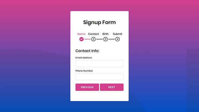
Multi-step forms are great when you need to ask the user for lots of information. They are less intimidating and more manageable that answering a long form. Using progress indicators or numbers encourages completion and reduces anxiety by clearly illustrating how much of the form remains. Multi-step forms are commonly found on e-commerce websites within the checkout process.
Avoid asking for personal information until the final step, as users are more likely to fill them out at this stage due to them having already invested their time and effort to get to this point. This is a cognitive bias known as the 'sunk cost fallacy'.
2. Only ask for what you need
One of the most important things to avoid when designing a form is to ask for too much information. Users hate filling out forms so why ask for information you don't need. Instead, limit the number of fields and ask for only the most relevant information. For every field to add to the form, you add friction and increase the cognitive load.
Travel firm Expedia, lost a reported $12 million every year by asking their customers to answer an additional question in their booking form. A study by Bounce also revealed, when a 11 field form is reduced to only 4 fields, its completion rate jumped by 160%.
3. Use conditional 'branch' logic
Conditional logic, also known as 'branch logic' is when you only display a question once the user has answered the previous question. Commonly used on sign-up forms to confirm a users password, branch logic is used to shorten forms by not displaying questions that might be irrelevant to certain users, therefore improving its UX and making it feel more personal.

4. Avoid using Captchas
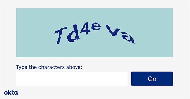
Captchas are tests inserted at the end of forms that only humans can answer correctly. They are often used to deter spam from occurring because they stop a form from being submitted until it has been deciphered and answered correctly. However, a study by Stanford University revealed that Captchas deter users from completing a form by up to 30%, citing friction as the main cause. When Animoto removed the Captcha from their sign-up form, they generated 33% more leads.
Captchas should only be used as a last resort, instead try using an automated spam detection service like Akismet or create a 'honeypot' using hidden fields to root out spam.

5. Use a postcode lookup
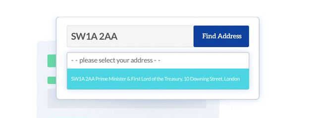
Instead of having to type out their address, lookup services like Google's 'Autocomplete' and Loqate allow users to fill out their addresses quickly and efficiently. All they have to do is simply enter their postcode and select their address from the drop down. This saves them valuable time and effort. They will instantly see if the postcode they have entered incorrect because their address will not appear.
When using postcode lookups you should clearly label which countries they apply to and let them enter both uppercase and lowercase letters. A manual option should also be provided for users with international addresses or those whom wish to enter their addresses manually.
Key takeaways
Forms remain one of the most important parts of any website. They are often seen as the final step in users completing their goals. It is for this reason that they should not be overlooked and we make them easy to use and complete. Splitting your form into steps and only asking for the necessary information will greatly improve their completion rate. Also, consider using branch logic to shorten forms and to use a postcode lookup service to assist users in filling out their addresses.
Lookup services like Google's 'Place Autocomplete' and Loqate allow users to fill out their address quickly and efficiently. Instead of having to type out their address