After many years of minimalism, designers are excited to see the return of maximalism; this year's most talked about trend.
But what is maximalism and is it here to stay?
What is maximalism?
Maximalism was a term first used be art critic Robert Pincus-Witten to describe a reaction to the post minimalist art movement of the 1960's. Renowned for being big, bold and in your face, maximalism breaks all the rules. Through colour and texture, this visually aggressive trend creates designs that are full of character and personality.
To put it simply, if minimalism is about simplicity and restraint, then maximalism cab be described as being about imperfection and excess.
Maximalism in web design
In an effort to make websites easier to use, designers have tended to adopt a minimalist approach. This removes all non-essential elements from the design to focus on the content that really matters
Adopting a minimalist approach, however, has led to many websites looking similar. They lack any originality and have become too predictable. Users are finding it harder to connect emotionally with them. As Roberto Cavalli explains "I really don't understand minimalism. It's so polite and boring."
As the industry become stale, it's not surprising to find designers turning to maximalism to inject some much needed creativity back into websites. It can lead to a more enjoyable and fun experience. Brands that have excelled in using maximalism include Nike, Balenciaga and The New York Times.
But let's be honest, maximalism is not for everyone. It largely appeals to younger audiences or those with a love for creativity. There is a very thin line between being more and being too much. It's vital that designers still adhere to current UX best practices when incorporating it into their designs, so not to impede on usability.
Here are 3 examples of maximalist websites.

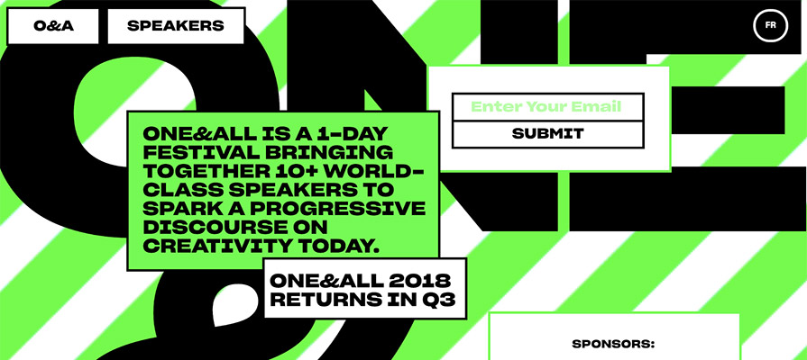
oneandall.io
One and all is a design festival for creatives based in Montreal, Canada. Their website is a great example of maximalism, with bold typography, overlapping objects and neon background

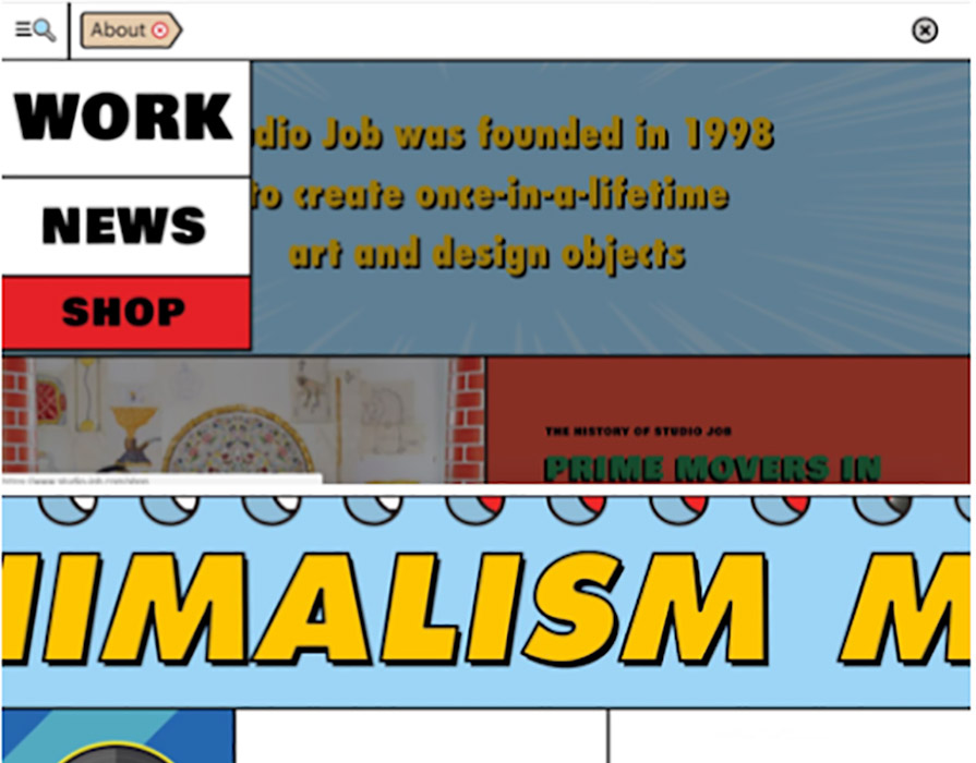
Studio-job.com
Dutch product designers, Studio Job have a fantastically bold maximalist website to showcase their art and design pieces. Every inch of space is filled with bright colours, text and moving parts.

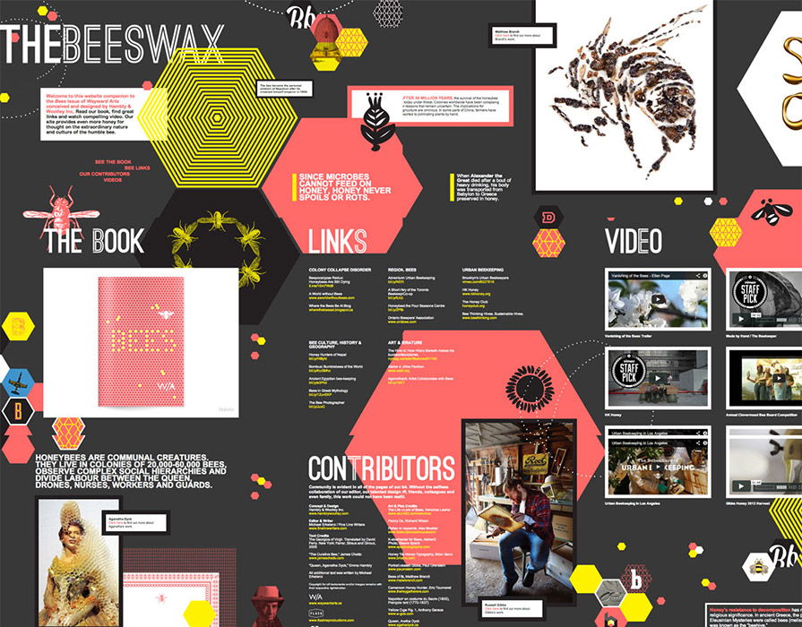
hamblywoolley.com/beeswax/
Hambly and Woolley have opted for a one page maximalist website to educate their users on the subject of bees and their importance on society. Once again, this unique website fills every inch of space with content. It uses overlapping elements and textures to great effect, keeping the audience entertained.
Key takeaways
As a designer, adopting a minimalist approach can stifle our creativity and make our designs look bland. But we can solve this by experimenting more with maximalism. This aggressive art movement encourages us to be bold with our colours and textures. It can reignite our designs and give them some much needed personality.
However, be sure to apply it sparingly, so not to alienate those users who find it overpowering or impede on a websites UX.
Minimalism will continue to be a popular trend, but we do expect to see more designers experimenting more with maximalism in 2020.