Following in the footsteps of Google, Netflix and IBM, Airbnb are the latest in a growing list of global brands ditching existing typefaces in favour of creating their own.
But what is a bespoke font and why are they being preferred ahead of more standard fonts.
Bespoke fonts
A bespoke font is a typeface that has been specifically designed for a particular purpose or client. They are often exclusive and can be costly to commission.
Modifying a pre-existing typeface is called a custom font. They are considered more affordable than a bespoke font, as they only require a certain amount of modification. For instance, a client might request to change the shape of a specific glyph.
Advantages of bespoke fonts
There are 3 main reasons to why a brand might adopt a bespoke font over a pre-existing one:
- 01. Originality
While there is a vast amount of pre-existing fonts available, many lack the personality and originality of creating your own. Creating a bespoke font gives brands more control and instant brand recognition. Having a font that consumers instantly associate with can be extremely powerful.
- 02. Functionality
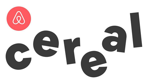
After failing to find a suitable font that worked both on small screen devices and print, brands such as Airbnb began producing their own. Karri Saarinen, Design Lead at Airbnb explains "The typefaces we reviewed were typically good for brand and print but not for UI, or vice versa". So with the help of Dalton Maag, a independent font foundry, Airbnb created their own, Cereal. "We wanted a typeface that would function beautifully online and offline whilst reflecting our brand personality".

- 03. Cost
Every year brands are required to pay licensing fees for the fonts they use. These licences can cost millions of pounds each year, so it makes financial sense for these brands to invest in their own
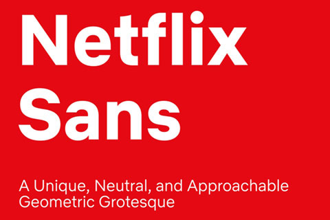
Earlier this year, Netflix decided to replace the font Gothom with their own bespoke font, Netflix Sans. "Licensing Gothom for all Netflix's marketing campaigns was getting too expensive" explains Noath Nathan, Netflix Brand Lead. "Developing a typeface not only creates a own-able and unique element...but it also saves the company millions of dollars a year".

Pre 2017, IBM used the typeface Helvetica as their corporate font, but due to not all employees having a licensed version of the font on their computers, the company decided to release their own, IBM Plex. Now they can feel assured that every Power-point presentation will look the same.

Key takeaways
The rise of bespoke fonts has begun and I believe they are here to stay.
Brands are starting to understand the power of typography and realise there's more to fonts than meets the eye. Many are paying far greater attention to the fonts they select to represent themselves. Some have ditched using standard fonts all together in favour of creating their own. This not only allows them to save millions on pounds in licensing fees each year but also enables them to differentiate themselves from their competitors.
However, not every brand has the financial clout of Netflix, IBM and Airbnb when it comes to fonts. Brands with more modest budgets, should look towards an existing typeface or selecting from the vast array of fonts available on the web. Google Fonts is an open sourced library with over 708 font families to chose from, and this is a great place to start