What are design systems?
Design systems are a hot topic, with many brands including Airbnb, IBM and Shopify investing in them to help scale their businesses.
But what are design systems and how do they differ from style guides and pattern libraries?
Let’s take a few minutes to explore the differences:
Style guide - a print or digital document that provides guidance on how a brand should be presented. It defines the basics; brand colours, typography, icons, etc and should be used as a reference source for colleagues.
Pattern library - an organised set of user interface design elements, often containing code snippets and use cases. Pattern libraries set standards and ensure large sites don't become inconsistent.
Design system - a collection of documents that helps a team build digital experiences. Contains guidelines, UI components and code snippets.
Benefits of creating a design system
The main benefit of adopting a design system approach is they promote consistency. It is vital for brands to be consistent throughout their online and offline experiences. Studies show that consistency is the biggest factor that separates a negative experience from a positive one. Users react positively to a sense of harmony; they familiarise themselves with the small details.
Implementing design systems saves time. When teams reference the same centralised design system, members no longer get confused or frustrated. This creates a more collaborative environment whereby everyone is speaking the same language. When new requests surface, rather than reinventing the wheel, people can reference the design system and reuse ready-made components. This speeds up a team's work flow and allows for new features to be released much quicker.
At first glance, a design system will limit a designer's creativity. They can feel limited or restrained, but in fact, they do the opposite. By solving the smaller issues, like font size and colour, design systems allow designers to focus on the larger issues like UX.
Here are some design system examples…
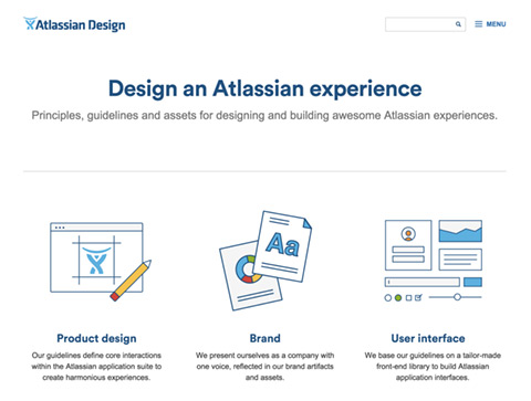
ADG - Atlasssian

Inspired by Apple’s Human Interface Guidelines, ADG is the design system Atlassian, a software company based in Sydney, Australia. Released in 2012 to harmonise its products, Atlassian has since built a dedicated ADG team of 18 full time employees. Most design systems look similar, but what Atlassian does differently with ADG, is they use iconography and illustrations where possible to make the document feel less daunting and easier to use.
Polaris - Shopify
.jpg)
Polaris, Shopify’s design system for online experiences, is a well-executed design system that showcases the thinking and culture of Shopify. Built to help both partners and merchants create apps more quickly and consistently, Polaris is now adopted throughout the company's UX. Sections include core principles, tone of voice and reusable components. Similar to ADG, Polaris uses illustrations effectively throughout to make what could be considered a boring subject matter, more enjoyable to use.
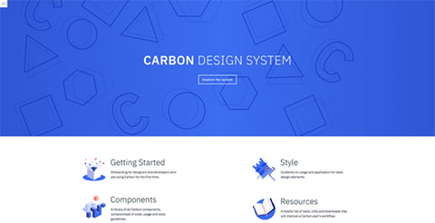
Carbon - IBM

Carbon is the design system for IBM Cloud products. It is a complete set of visual, UX and code guidelines which create a basis for how all IBM products should look and feel. Carbon is similar to other design systems, it is well documented and easy to use but when compared to Shopify’s Polaris, Carbon lacks a section on tone of voice and examples of content.
However…
The success of design systems rests on people truly collaborating and communicating with one another. Introducing a new way of working requires people to change their existing mentalities and behaviours. As Mark Boulton explains “The design process is weird and complicated, because people are weird and complicated”. You can have all the right tools in place, but if everyone isn't on board or willing to cooperate then your design system is going to fail.
Developing and maintaining a design system requires thought and time. They can be a challenging. They involve knowing why things are designed in a certain way and being able to articulate this and transfer that knowledge to others. As Nathan Curtis describes, “a design system isn't a project, it's a product serving products”. It is a living document, forever needing refining to stay relevant.
Key takeaways
Design systems are not a fad or a gimmick. Whilst they do require effort to create and time to maintain, they're worth the investment. Design systems improve design consistency, productivity and quality. Don't be afraid of design systems, they're not limiting, and are there to help you achieve your goal; providing a more consistent experience across online experience.
So, give them some thought.