In the past year, a distinctive new design trend has emerged - asymmetrical design. Web designers are deliberately moving away from traditional symmetrical, grid style layouts to experiment with asymmetry. Their yearning for more freedom has led many to ditch the once worshiped grid and move content into areas previously un-imageable.
But what is asymmetry, and can it lead to a better design?
What is asymmetrical design?
As the name suggests, asymmetry is the lack of symmetry. It is not a lack of balance or harmony as some would wrongly suggest. Where symmetrical designs tend to feel flat and boring, asymmetry conveys movement and feels exciting.
Depending on how you use it, asymmetry can generate interest and draw attention to certain areas which might have previously been lost. It can also be used to overlap elements top top of each other which can give a website the perception of depth.
Let's take a look at some asymmetrical websites that on first glance may look like they don't follow a grid, but in reality, they do:
.jpg)
Phoenix, a Montreal based design studio, uses a delightful combination of text and image tin an unusual layout to capture the user's attention.

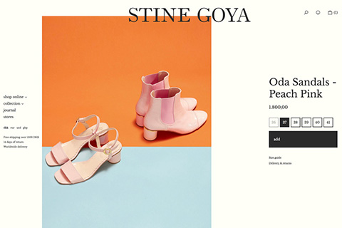
The larger product image, seen on Stinegoya, is beautifully offset by the smaller text. This natural balance between a single large object and a densely packed alternative is a very common approach.

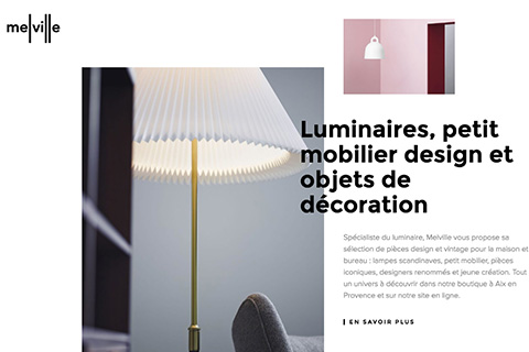
French lighting and furniture specialists, Melville, creates an asymmetrical layout through overlapping images with text. Its nothing drastic, but it does add originality to the website without sacrificing usability.
Unfortunately, some designers choose to dismiss asymmetry altogether as it is difficult to master. But when given a chance it can produce some beautiful, eye-catching designs. It just requires some careful planning first.
First, break the design into small sections. Then plan what you want to achieve with each section. This will help determine how best to use asymmetry. The aim is to help create balance so no one section feels heavier than the rest.
It's then up to you to trust your design instincts.
Breaking with care
Before you get too excited, asymmetrical layouts are not suitable for every website. As Steve Jobs once said, "design is not just what it looks like. Design is how it works". News trends emerge all the time, so its vital designers do not forget the importance of UX in favour for the aesthetics.
Its also worth mentioning that asymmetry doesn't translate well onto smaller devices. Designers should therefore continue to present information in single column layouts on mobiles.
Key takeaways
For many years, website layouts looked the same - boring and symmetrical. But in 2018, designers began breaking the rules. They started to position content outside of the traditional column structure. Asymmetry is ideal for those brands who wish to break free from the mould and want to differentiate themselves from their competitors
Whilst, asymmetry is not suitable for every website, we do suggest combining it with symmetry to make content really stand out.