People are surrounded by micro-interactions every day, often without even realising. They have become an essential part of our digital life. Every time we set an alarm on a mobile, respond to an email or like a friend on Facebook, we engage with micro-interactions.
But if they are so subtle, why should designers care about them?
What are micro-interactions
Micro-interactions are small animations that let users know they have successfully performed an action. They vastly improve the user experience of any website or app by humanising the experience. They are fun and encourage users to return without adding too much distraction. Without micro-interactions, a site or app can feel bland.
There are four elements to a micro-interaction.
- Trigger - initiates the action.
- Rules - determines what happens.
- Feedback - lets users know what is happening.
- Loops & modes - determines the meta rules.
When it comes to micro-interactions, it's important to remember less is more. Don't over design them; keep them simple and easy to understand. They should'nt distract the user from completing their task, but should complement your site/app and take no longer than a second to complete...hence, the word micro!
Here are some prime examples of micro-interactions:
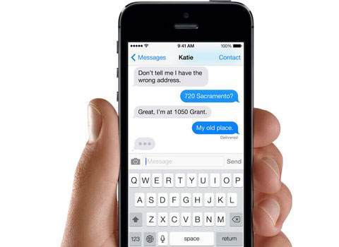
iMessage
The speech bubble and little circles that appear when the other person is typing show the conversation is active. Also, the 'delivered' note appears when they have received your message.

Tinder swipe
Tinder's swipe action is one of the most easily recognisable micro-interaction. Swipe right for 'like' or left for 'dislike'. It's fun, quick and original, and one of the reasons why the app became so addictive.

Burger menu
An increasingly common micro-interaction found on many websites is the burger menu. This menu icon turns into a 'close' button when you interact with it.

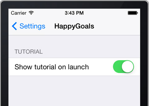
Toggle buttons
Another popular micro-interaction are toggle buttons that show the transition between two states. Seen as default buttons on iOS and Android devices.

Final thoughts
As a designer, our job is to create experiences that users want to repeat. Micro-interactions help us achieve this goal by making sites more engaging, by making the experience less machine and more human. They vastly improve the UX and make any site more appealing.
Just remember to keep it simple, the best micro-interactions are those that require little thought