Why redesign a logo?
In life, there are seldom aspects that remain the same. The modern world is consistently in a state of change, upgrade, or transformation; much like the redesigning of brand logos. Just with men and women going through personal makeovers, so do brands and their logos.
The general goal of most brands undergoing a logo redesign is to bring a sense refreshment without hindering any brand equity. Logos needs to be both consistent but also flexible; a tricky yet doable process. Brand logos going through a redesign, no matter the degree of actual change, are seen across most industries.
Are there recent examples?
1) Deliveroo
Established in 2013, Deliveroo began offering their food delivery services to hungry customers across London. Fast forward several years and the online food company has been operating in over 200 cities across the UK, Europe, the Middle East, and Asia to much success.
DesignStudio, a London and San Francisco based design agency, described their appointment to redesigning the Deliveroo logo as “we needed to develop a symbol that could be recognised globally. An iconic shorthand for awesome food, delivered everywhere. A mark of quality that you can always trust, whatever you order”.
Several meetings and design workshops later, Deliveroo unveiled their new, more ambigious logo in September 2016 compared to the previous logo, which contained a disctinct kangaroo.
.jpg)
2) Aldi
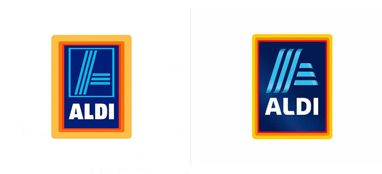
Following similarly in the food industry, the leading discount supermarket chain, Aldi, unveiled their refreshed logo in March of 2017. According to an official Aldi press release,
“The new logo matches the modern appearance of [Aldi] and reflects the significant developments that the company has recently undergone in the interests of its customers”

The new logo is not substantially different from its predecessor. But for a not so keen eye, the changes include
- Different font
- Gradients instead of block colours
- Removal of the blue border around the ‘A’
- Reduced thickness on outside orange border
- Bolder ‘A’ with a 3D effect
- Brightened and sharper colours
3) Lufthansa
Taking their logo to new heights, quite literally, the global airline company Lufthansa altered its iconic 100-year logo and signature colour scheme in early 2018. First introduced in 1918, the original logo depicted a flying crane and by 1960 a circle was placed around the bird along with establishing its distinctive deep blue and warm yellow colour themes. Since then there have been little to no changes; nearly 60 years of consistency!
The new 2018 logo, however, favoured a more minimal and thinner approach to its designs. The biggest changes include a noticeably thinner circle around the crane, added spacing between the crane’s body and font and choosing to remove the yellow colour from its main displays but keeping for subtle branding assets.
.jpg)
Overall, the redesign has been described as
“the idea wasn’t to reinvent the identity but to improve on it the same way you improve on airplanes — you can’t fly the same ratchety thing for decades, you iterate and improve”
4) The Guardian
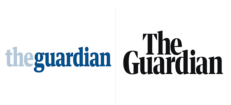
For millions of people that subscribe to The Guardian’s print or digital issues, the start of 2018 marked a new era for the daily newspaper. Not only did The Guardian switch to a tabloid format (previously a berliner style and before that its long-standing broadsheet style), but it also launched a new look with its logo as an effort to save in printing costs. Overall, the newspaper no longer boasts a distinctive blue nameplate rather opting for a simpler and blacked out version with a new leading typeface.
Alex Breuer, the executive creative director for The Guardian described the changes as
“The new design has readability at its heart, with a new headline font and a new colour palette as core elements. At the forefront is the bold new masthead, which represents The Guardian’s place and purpose in today’s turbulent news agenda”

Can redesigns be unsuccessful?
Simply put, yes. Despite all the best effort and attempts at making something “new”, there have been various instances of redesigned logos being victim to harsh responses and controversy - often from brands with strong supporters or long history. Individuals perceive logos differently and with many contexts in mind.
For instance, Leeds United Football Club revealed a redesigned crest in early 2018 depicting the “Leeds Salute” only to face fierce and quick backlash from passionate fans and audiences alike. Managers, however, claimed there was extensive, six-month long research conducted and 10,000 people consulted prior to its official display. Still, the opposition was overwhelmingly negative and eventually led to an open submission with a new crest being chosen by fan voting.
.jpg)
Now what?
All things considered, these redesigned logos (plus many more!) signified an opportunity for even the most established of brands to modify how they showcase themselves. Although the target audience only sees the final logo, every decision or change was highly scrutinised and debated to ensure a favourable outcome; even though we know that there are instances of negative reception. Logos are a small, but very important, component of a brand.
If you’re brand or company looking to redesign a logo or even start from scratch, get in touch - we’d be delighted to help!