Striving for more creativity has led many web designers to step away from the traditional grid layouts we've been accustomed to and start breaking the grid. In doing so, designers can produce some eye catching results - sites that have personality and originality.
But before designers go experimenting with the grid, they must first understand what grids are and how to use them
Grid systems
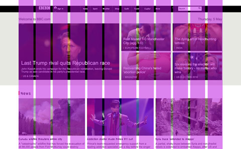
While some websites appear to follow no grid, in reality most do. A grid is essentially the skeleton of a website. They are a set of invisible lines that help designers structure content in an easy to understand order.
As Design Shack points out "The grid is the foundation that helps you design something that feels organised, clean and easy to follow".

A grid system is made from 3 key components:
- Columns - The building blocks of the grid. They are the vertical spaces seen between the gutters.
- Margins - The area surrounding the content.
- Gutters - Negative space that separates one column from another.
A grid system not only improves the quality of the design but also speeds up the design process. There are many advantages to using grids:
- Forces consistency - Helps the user understand where to find the next piece of content.
- Creates balance - Using a grid creates a connection between the elements that make up your page.
- Establishes a hierarchy - Not all content is equal. Designers are forced to prioritise content and create an hierarchy.
There is no perfect grid, they vary in size and complexity. One of the most common grid layouts found online is Bootstrap. A responsive, mobile first grid, Bootstrap is based upon 12 columns with a total max width of 1200px. It is extremely easy to use and very adaptable.
Ways to break the grid
The disadvantages with grids is they can feel restrictive, limiting a designers creativity. Sites that adopt the same grid layout have a tendency to look the same, they've become too predictable.

If a designer is considering stepping away from the traditional grid and would like to create a broken grid layout, there are some interesting techniques they may wish to consider:
- Break the grid without breaking it - Try placing shapes and type on different alignments within the grid.
- Focus on the detail - Draw attention by breaking the grid with one simple element i.e. shapes, backgrounds and accents.
- Overlapping and layering elements - Allow elements to overlap and cross into each others space.
Final thoughts
By now, you hopefully understand what grids are and why designers use them. By breaking the grid, designers can create exciting layouts that are eye catching and unique.
However, it is extremely important to consider your target market. Broken grid layouts are not suitable for all users and industries. For example, the older generation may find consuming content that is displayed in a broken grid layout difficult. Opting for a experimental layout should not result in designers abandoning their UI principles. Sites should remain accessible and easy to use. Try breaking the grid sparingly and in playful ways.