Design trends: Duotone images?
Duotone images are the latest web design trend to hit 2016. In this article I’ll look at what they are, who’s using them, and why. So what are duotone images?
In its most basic form, a duotone image is an image composed of two colours. The concept is not new, as they originated from the print industry, where images would be printed with a dark base colour, with a lighter, second colour printed over the top.
However thanks to Spotify’s 2015 campaign, Year in the music, duotone images are once again growing in popularity, with a number of designers using duotone in their web projects. Unlike the print industry, where they were often dark or sepia toned, today’s duotones are often brightly coloured, with clashing colour combinations. The aim with duotone is to create an image that demands attention but includes plenty of contrast for the image to show through. Be aware that not all images work in duotone and finding the correct colour pairings can be tricky. As we see below, sites that use duotone effectively are ones that use it in moderation.
Year in the music
.png)
In 2015, with the help of Collins, a design agency based in New York, Spotify released a bold new brand identity that consists of colourful duotone images of the artists. The duotone look has become so much a part of Spotify’s brand identity that Collins’ director of experience design, Brett Renefer, has created software that replicates the process. I’m a big fan of the new branding, and love how the powerful photography combines with the duotone treatment.
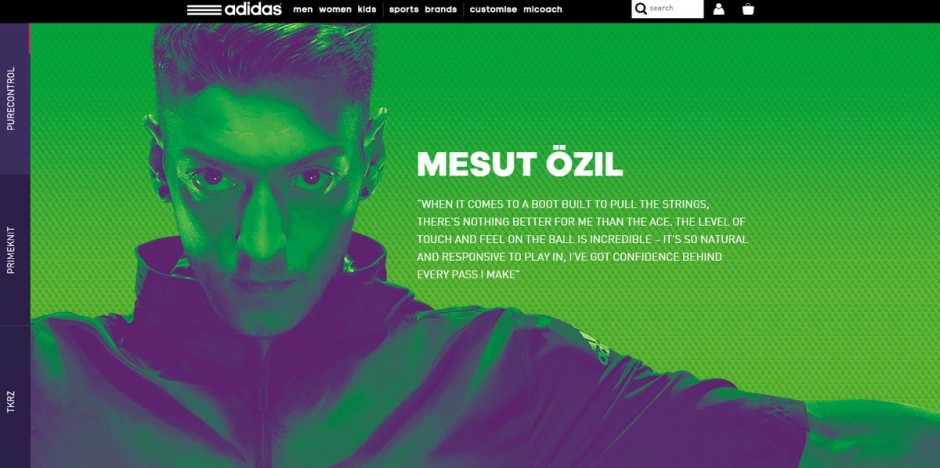
Adidas Football

Sports retailer Adidas, are continually looking to adopt the next biggest trend in fashion, so it wasn't surprising to find a duotone image on their homepage. By pairing strong hues together, Adidas has created an image that is not only visually appealing but also instantly recognisable.
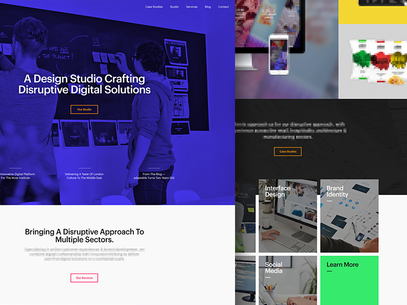
Adaptable

Digital design agency, Adaptable, based in Birmingham, UK, have taken duotone to a new level by overlaying it on top of a full width video hero. By merging the two emerging trends together, it shows potential clients that Adaptable are at the forefront of design and innovation.
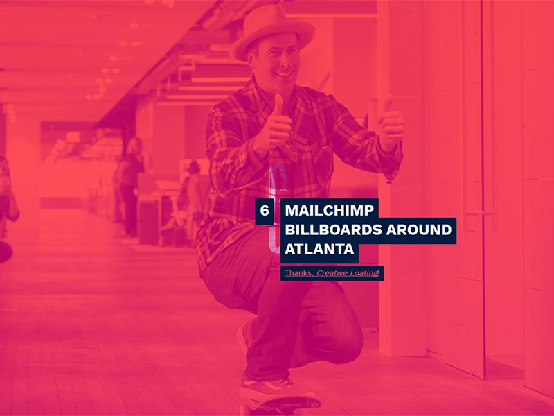
Mailchimp

In 2015 Mailchimp, decided to use full width duotone images to illustrate their achievements in their Annual Report website. Parallax scrolling and a colour transition lead the users through the company’s achievements.
Conclusion
Duotone images are a great way of making a site feel modern and stand out amongst others. Choosing to pair bright contrasting colours can make a site more impactful and memorable and at the same time preserving the beauty of the images.