How to turbo charge your online forms
Filling out forms is a chore, so it’s important to make them as simple and user friendly as possible. The easier and clearer you make a form, the better the quality of information you will collect. Here are some helpful tips to ensure your form is organised, user friendly and fulfils its purpose.
01. Don't be greedy, keep it short and simple
Users are impatient, so it’s vital to keep forms as short as possible. Don't waste their time by asking them unnecessary questions as they will simply abandon a form rather than take the time out to fill it out. The fewer fields your form has, the higher your conversation rate will be. It’s all about asking questions that are meaningful and will help them complete the process.
02. Provide clear visible labels

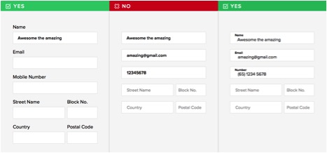
The trend with todays web forms is to place the label within the field, which disappears when the user starts typing. This is ok for short forms, such as login pages, but for longer forms it is best to provide clear permanent labels. This allows the user to understand what is expected of them even when they've started typing.
The label itself should be as specific as possible. Making the user think reduces the likelihood of them completing the form. For example, if your label reads “Name” do you mean “Contact name” or “Company name?”
03. Consider touch devices

Given the rise in users accessing the web through mobiles and tablets, it is imperative that forms are mobile friendly. Mobile users will be using their fingers to navigate so it is important they are able to select the fields. The recommended minimum height for form fields on mobile is 40px. It is also important to leave sufficient spacing between fields, as you don't want users to interact with two form fields at any one time.
04. Size fields accordingly

It has been reported that users find forms easier to read when fields are sized accordingly, so size the fields dependant on their expected input. For example, when you are expecting a postcode of 7 characters, don't give the field a width of 100%.
05. Provide both server and client-side validation

There are two types of form validation, server-side and client-side.
Server-side validation appears when the user has completed the form and has clicked submit. By submitting the form, it is sent to a server, where it is validated. It either points out that the user has made a mistake or reassures them that the data they provided is correct.
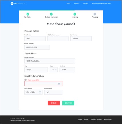
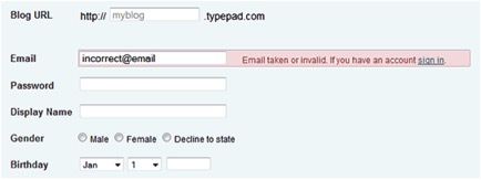
Client-side validation works by alerting a user to errors immediately, saving the time to submit the form. If they make a mistake, an error message will appear next to the field. The draw back to client-side validation is that you are relying on JavaScript to validate the form. If the user has disabled JavaScript, it means they are able to bypass the validation process.
We would advise combining both server and client validation together. This way you get the best of both worlds; fast response, secure validation and better user experience.
06. Label mandatory fields clearly

It is important to illustrate which fields are mandatory and which ones are not. The most common approach is to illustrate mandatory fields with a red asterisk. The asterisk is effective because it uses both colour and shape, meaning that all visitors can see it. Try to keep the number of mandatory fields down to minimum, otherwise you’re adding complexity to the form.
To summarise
Web forms are essential part of any business, whether it's a checkout form, login screen or a simple contact form. A well-designed form can be the difference between a conversion and an abandoned page. Forms don't have to be a source of frustration; they can quick, fun and easy to use if designed correctly.