The “hamburger menu”, known to many as three little parallel lines, is becoming increasingly popular within web design to illustrate a hidden menu. Brands such as Time Magazine, Rdio and Squarespace all use a variation of the icon on their sites. So why do these sites use the hamburger menu and what are its benefits? Is it really here to stay or just the latest flavour of the month?
The hamburger menu simply allows a website’s menu structure to be condensed into a single icon. When clicked, page links are revealed for the user to navigate the site. It was first introduced as a way of saving screen real estate in mobile apps, where space is extremely limited. These days however, more brands are turning to the icon for navigating desktop sites.
Why use a hamburger menu?
Firstly, hamburger menus look modern and minimalist. It serves as a great way of de-cluttering website headers, which have previously been oversaturated with too many page links. Brands should no longer be afraid to hide their navigation, as many designers believe that the hamburger icon has achieved universal status. Users, especially the younger generation, associate the icon with being a menu or list, and will interact with it. Daniel Bernard, head of Product at Time Magazine, is confidant that older generations will adjust in time. He states, “One of the things we were trying to accomplish with the times.com redesign was to think about the future and where people are going. We felt confidant that they would get there and that we could be one of the sites that helped them.”
Brands that are less confident help their audiences by labeling the icon with “menu” or/and make the icon look like a button. Usability testing has proved that if you label your hamburger menu with the word “menu” and make it look like a button, users are more likely to interact with it. A study called “Mobile Menu AB Tested”, by Exisweb revealed a “12.9% increase” in the number of users who interacted after adding the word MENU and making it look like a button. It could be that using the word MENU draws more attention but it also adds confidence.
3 examples of hamburger menus

They use the hamburger icon accompanied by a “MENU” label. It has smooth interaction when you hover over the icon, which reveals a close icon. The menu itself slides in from the left.

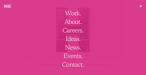
Digital design studio Huge have a minimal hamburger menu that reveals a striking pink transparent overlay. I love the smooth interaction seen as when the hamburger transforms to a close icon.

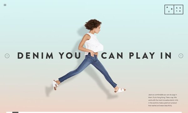
A full screen apparel catalogue, Ayr.com, uses a minimal hamburger menu to reveal a full screen menu overlay.
What’s wrong with burger menus?
Critics of the hamburger menu are less than convinced. They firstly and most significantly argue that using the hamburger menu simply adds an extra step where it is not needed. When previously reaching a page took one click, it now takes two. They question whether the icon is universally recognizable and they don't believe a user should have to go searching for what they are looking for. They believe older generations don't understand the icon and what it represents, therefore running the risk of alienating these users from using your site. Designer Ben Garratt voices his frustration “It makes no sense to me from an UI or UX perspective, if your menu really needs to be so insanely large that you can’t display it nicely without hiding it behind a fairly non-descript icon”. Carl Johnson, web developer at Atlantic, actually questions the hamburger menu creativity. “The hamburger can lead design teams astray by letting them avoid making hard choices about priorities. Just shove them all into a hamburger menu because they’re all top-top priority!”
In conclusion
I accept that the hamburger menu is not suitable for all sites and audiences. It forces the user to search for what they are looking for when they first arrive to a site, adding an extra step where it is not needed.
However, the digital world is forever changing, and users today are far savvier than they were a year ago. With that in mind, I predict the use of the hamburger on desktop sites will continue to grow. I believe with time, brands will become more confident with hiding navigation and users will learn to associate the icon with being a menu that they must click and interact with. I disagree with notion that the hamburger icon is universally recognizable. Some older users might be confused and will not know what to do. I would therefore suggest that if you do decide to embrace the hamburger menu that you label it “MENU” and make it look like a button. Not only does this increase the number of people who interact with the menu but will also help older audiences.