We can no longer assume that people browsing the web are using a desktop computer with only 2 or 3 popular screen resolutions. More are turning towards devices such as tablets and smart phones. According to Mashable, “in 2013, 17.4% of global Internet traffic came through a mobile device”. With this figure rising in 2014, Morgan Stanley predicts ‘mobile internet usage will match that of desktop usage’ so there is a growing need for websites to become mobile friendly.
So firstly, what is responsive design and secondly, how can my business benefit from having a responsive website?
What is responsive design?
Responsive design is a process whereby a single website adapts according to the screen resolution it is being viewed on. Someone opening a site on their laptop will be shown the same content as if opened on their smart phone, albeit displayed in a different way. Responsive design is aware of the screen constraints and through using flexible grid systems, imagery and media queries, adapts the site’s content accordingly. You no longer have to have different websites for different devices, or zoom in to find the content you are looking for.
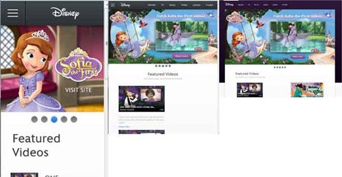
Sites such as Sony and Disney are great examples of responsive design. Simply click on the links above to enter the site, and change the size of your browser to see responsive design in action.

The benefits of responsive design.
So now you know what responsive design is, what are its benefits?
01. Single website.
There is no need to have a mobile version of your website. Responsive design adapts your content so that it can be optimised for mobile devices. There is no need to maintain and upload to two websites.
02. Single URL
Responsive design allows for a greater user experience. Your viewers will not be redirected to a mobile version of the site. Happy customers, means a happy business.
03. Lower cost
One website is cheaper than two. Not only to build but also to maintain.
04. Better user experience
Responsive design offers a better user experience. No longer do your users need to zoom to see content. Instead, the content adjusts to the screen resolution, making it easier and more convenient for users to read. Responsive design is not Mobile design.
A Responsive site is not the same as having a mobile site. Mobile sites are specifically designed for handheld devices. They can have faster loading speeds to that of a responsive site due the fact that they can be optimised to mobile standards. Images can be smaller in file size and code built specifically for mobiles.
Mobile sites are less than ideal in most cases. Firstly, it is more expensive to have a main site and then also build a mobile site. You now have two websites, both of which need maintaining, and with separate SEO to manage. The mobile site may require a completely different set of images, which will take time to generate and import. You also require the user to remember two URL’s, or otherwise they will be redirected to your mobile site. This can be confusing and may take a few seconds to load.
In conclusion
We can no longer assume people are using a desktop to browse the web. Recent figures suggest more are now turning towards using their tablets or smart phones. It is now a necessity for all websites to become multi-device friendly.
With this in mind, there are two possible routes open to business. Firstly, building a website that is responsive, or secondly, having a separate mobile site for mobile devices.
In my opinion, business should turn more towards having a responsive website. It is no longer a design trend, but more of an effective way of making a site work seamlessly across multiple devices. It is more cost effective to build and maintain one site rather than to have two separate sites.
However, having a separate mobile site can have its benefits and should not be discarded. In some situations, a mobile site can lead to a better user experience. They allow for the information architecture and content to change and be more mobile specific. Images can be optimised making loading speeds faster.
For me, if your looking for a new website, you should be really considering a responsive website. The future is responsive.