Every month I hope to showcase the most creative sites on the web. Here are a few goodies found for September issue.
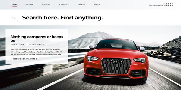
Audi have revealed a redesign to its audiusa.com website. The new site designed by AKQA, creates an emotional connection between Audi’s cars and their consumers. It incorporates both responsive and adaptive design, offering users a seamless experience across all devices.
AKQA have used whitespace effectively to create a modern and stylish website, that corresponds well with Audi’s brand. It is interesting to see that they have not used a traditional search bar in the header, but instead opted to use a ‘title search’. The ‘title search’ works in the same way as a search bar, but is positioned prominently underneath the header. It could be said that title searches are the next phase in the evolution of search boxes. Could it be that we may see more websites designed using search titles?
For me, the search box is still an essential part of web design. Users still expect to find some sort of search functionality within the header. However, this doesn't mean it has to be a traditional search box, with a search field. I believe designers can be more creative than that. Sites are turning more towards using search buttons, which the user needs to interact with to reveal the search field. These are great when space in the header is limited, and you want a minimal design.

In July 2014, Airbnb announced its new logo, along with a redesign of its website. They said goodbye to its old “bubble logo” and presented the “Belo” logo. The “Belo” is meant to signify Airbnb’s core value, “belonging”. The new logo saw mixed reactions, with some people suggesting on social media that the logo resembled a female’s body part. Others suggested that the logo was too similar to that of “Automation Anywhere” a tech company established in 2003.
Personally I like the new logo, it looks fresh and modern. The choice of colour (red) is inviting, and the iconography is great. I agree that the logo looks nearly identical to that of “Automation Anywhere”, but I would say that nearly every idea has been done in someway. It is very hard to please everyone and stay original. We all view things in different ways.
With regards to the redesign of their website, I think Airbnb have done a great job. They have decided to follow the flat design trend, replacing shadows and gradients with flat colour. As a result, Airbnb’s website looks modern and fresh. It continues to attract its younger audiences but also becomes inviting to older generations. Whether you're a student looking for a place to stay whilst travelling or an older couple looking for their holiday, Airbnb as something to offer. The booking process has been simplified, making it easier to book a room. The search listings page, seen here, is a favourite of mine. I love how Airbnb have incorporated the map feature into the search results page. This makes finding accommodation much easier. You no longer have to enter the accommodation page to find its position within the map.
Andershede.com is the personal website of Danish web developer, Ander Shede. Employed by Gejst Studio, a web design studio in Denmark, Ander creates functional and engaging responsive websites.
I’m intrigued by the gradient overlay used on the homepage videos. It is quite refreshing to see gradients being used particularly when it seems most modern websites adopt a flat design. I really like the simplicity of the website and how Ander uses transitions to keep it modern and interesting. For example, using parallax scrolling on the case study imagery and rotating the logo when the mouse rolls over. This website is a great example of a portfolio website.
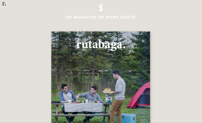
Rutabagamag is an online French food magazine helping you to maintain a simple and healthy lifestyle. The website showcases the latest editions of the magazine and allows users to enter and preview each edition.
The website uses strong photography, a great colour palette and a unique layout. I particularly like how the magazine pages use parallax scrolling to reveal the recipe image. I also think fixing the recipe ingredients to the top of the screen is a great touch. It enables the user to still see the ingredients whilst reading the instructions. Using a diverse layout keeps the users interested whilst they scroll the page.
Next Month
If you feel I have missed any sites that are worthy of mentioning in the next edition of Sites of the Month, please comment below your recommendations.