Luneteyewear.com
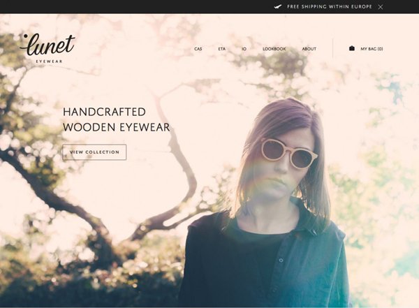
Lunet Eye Wear is a manufacturer of designer sunglasses for both men and women. Based in Romania, their latest collection of hipster sunglasses are made from natural materials such as walnut and oak. When you first arrive on the site, you are met with a full width photo showcasing the product. Big background images are very popular in modern web design and when used correctly can be an extremely powerful tool. I think this image works perfectly in capturing the brands image and I love the retro/vintage filter that is applied to the image. I really like the overall style of the site and the minimal approach taken for buttons. However I would recommend these have a more recognizable active state when you roll over them.
Leodislager.com
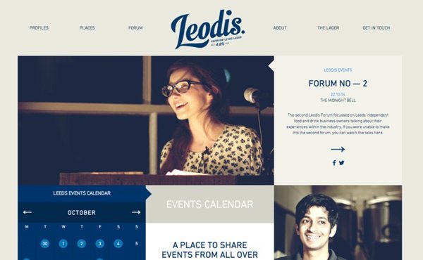
Leodis is a continental style premium lager produced by Leeds Brewery in West Yorkshire. Using eastern hops and genuine yeast, Leodis is a smooth, easy to drink lager, with a distinctive taste of caramel. The site, designed in-house, promotes small local businesses, pubs, and like-minded creative’s in the Leeds area.
The homepage looks fantastic. It looks and feels very modern. I really like how it uses tile-styles to divide content and aid casual browsing. Tile-styles are clearly trending on the web right now and were first made famous by Pinterest. They display content in a creative way and their boxed structure makes them accessible to mobile view.
Many websites now choose to fix their navigation to the top of the page. This makes browsing far more easy. Leodislager.com is no different, but in doing so chose to swap the text logo with an owl logo. I also really like the flip transition that they've applied.
Getrest.co
Rest Goods, a USA based manufacturer, has just announced the release of their product, Composure, a charger dock for the eagerly anticipated, Apple Watch. Made with a Walnut top and steel undercarriage, the product looks amazing. Firstly, I love the choice of colours used throughout the site, especially the blue gradient seen in the main image. The product photography is stunning and superbly shows the craftsmanship and quality of the product. I really like the slight parallax effect seen when you scroll the homepage, firstly, on the hero image and then secondly, on the illustration at the bottom of the page. It might be minimal, with some users not even noticing the effect, but it keeps the site interesting and adds that touch of class.