1. Anyone can do it
The most common misconception of web design is the belief that anyone can design a website. Everyone is entitled to have his or her opinion on what is beautiful and what is not, but this doesn’t make you a designer. Neither does knowing how to use programs such as Photoshop or having some knowledge of HTML and CSS.
Web design is so much more. Web designers don’t just create visually stunning things; they deliver messages and solve problems. Understanding information architecture and user interface design is key to designing a successful website. It is important not to just focus on the aesthetics of a design. A site needs to be functional and easy to use. Web designers have an understanding of composition and hierarchy, they know when to use colour and typography. Fonts are carefully selected to complement a design and enforce a brands image.
2. The user won’t scroll down
There is some debate in web design as to whether ‘the fold’ is relevant. As discussed in a previous blog post ‘Is the role of the homepage changing”, clients are afraid to put important information, like calls to action, near the bottom of the page. Fearing that the user will not scroll, they request that this information be placed near the top, i.e. ‘above the fold’.
Users in fact do scroll. With more people using their mobile phones to access the Internet, more are becoming accustomed to vertical scrolling. Be sure to read ‘Life above the fold’, by Paddy Donnelly, an article discussing the shifting perception towards life below the fold. Showing important information below the fold, allows web designers to spread content evenly throughout the page. They are no longer consigned to a small area near the top.
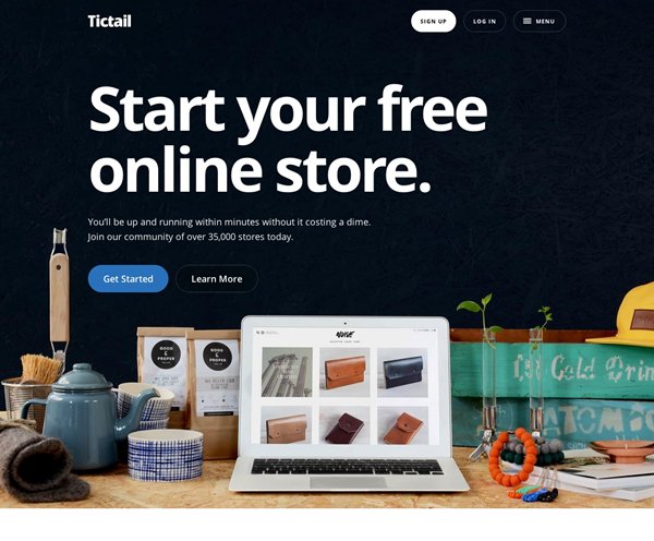
Sites like usatoday.com and tictail.com are great examples of sites that spread important information evenly throughout the page. They have confidence in that their users will scroll.
3. A new website will attract visitors
Many clients believe that having a new shiny website will automatically attract them new customers. Unfortunately this isn’t the case; the new site is just the beginning. It is no good having a new shiny website, if your potential customers don't know about it, or cannot access it. Don’t expect anyone to find your website on their own. After a site has been launched, you need to promote traffic to the site. Social media or even word of mouth can be used to reach a wider audience. Sites should be optimised with tags, links and be regularly updated with current content to ensure that the site is easy to find on the search engines, like Google, Yahoo and Bing.
4. It should look the same on all browsers
Users are able to access the Internet using multiple browsers, i.e. Google Chrome, Firefox or Safari. Each one of these browsers renders code in slightly different ways. It is therefore difficult for developers to make a website look identical across all browsers. Developers will code a site to ensure it is compatible across all browsers and then make visual changes when necessary.

5. The more content, the better
Content is one of the most important parts of a website. Clients tend to believe that showing more content on a website is better. However this can do more harm than good. Showing too much unnecessary content can overwhelm and distract users.
Instead clients should focus their attention on the quality of the content rather than the quantity. The advantage of showing quality content is that it adds value to users, drives traffic to a site and can increase rankings in search engines. Content should be informative, relevant and encourage user interaction. Continually updating content can encourage users to return to a site and create loyalty. Creating quality content requires time and effort, and may need careful planning and research. I would recommend that you do not leave content generation to the end of the project.
Ideally, a designer would like to have the finished content before they start creating their designs. It can be very frustrating for a designer to have to re-adjust their design mid-way through the project. If the content has not been submitted, the designer will resort to using ‘lorem ipsum’ as an alternative.
6. Fill all empty space
Don’t underestimate the importance of white space. Clients should embrace the use of white space, as it helps users to focus their attention and digest information. When arriving on a site, the first thing a user will do is to scan the page and divide information into digestible areas. Minimal websites are becoming very common, with Apple.com a great example. Adopt an apple.com approach and think ‘less is more’.
07. Flash intro
For many years, Adobe Flash was an integral part of website design. Designers would use Flash to create whole websites or animate banners and buttons. It became the norm for websites to use Flash in some way or another and clients would often request that their website have a ‘Flash Intro’.
Websites have been gradually moving away from Flash as a growing number of users are using smartphones and tablets to access the Internet. Flash is not mobile compatible and clients should therefore no longer request for a Flash website. Instead developers use HTML5, which allows a certain level of animation whilst having the added benefit of allowing the content to be viewed on mobile.
08. A website should last me 10 years
Web design is ever changing. Technology and trends change. What works today might not work tomorrow and, what looks current today might look dated in 5 years time. Don't expect a website to last forever. Clients should regularly update their content to keep their site looking current and entice users to return, and should not be afraid to refresh the design.
To sum it up
If you are a client who is looking to design a website, we hope this post is beneficial and puts to rest some of the misconceptions of web site design.
If you are a designer, and you think we have missed any other common misconceptions then please feel free to get in touch and tell us your stories.