Most captured spooky and cheeky spirits of the season but some of them will make you think twice about your choice of costume. However, all of them are great examples of how brands and organisations can create successful campaigns that piggyback on large events.
Kellogg’s Scary Rice Krispie
For its new range of rice krispies, “Malloween” and “Totally Shocklately”, Kellogg’s put up free vending machines at both Dublin Institute of Technology University campuses and shopping centers. But is it TRICK or TREAT? When people reach out to collect their free krispies from the machine, a hand reached to grab them.
So far, the campaign videos have had around 240,000 views on the brand’s YouTube channel.
Cheetos TP Project
Cheetos TP project will let you cause mischief this Halloween and virtually cover a site or building with toilet papers. Enter the post code or the name of the street that you want to attack, and once you are done, you can share the image with your friends through social media channels. At the time of writing this article, 115,829,926 feet of toilet paper had been dropped from Cheetos helicopter.
Tide - Scared Stainless
I love these short videos from Tide and Vine seems to be a perfect platform for hosting them. Based on the classic horrors “Carrie”, “The ring”, “Shining” and others, the vines will make your hair stick up. The Procter & Gamble brand has around 114, 000 followers on Twitter.
Snickers - Headless Horseman
The brand’s message “You are not you when you are hungry” is one of the cleverest ad slogans from a snacking brand - probably because it makes me think that Snickers fully understands how I feel just before lunch. Their most recent campaign added a Halloween twist to the slogan, and I think it couldn’t have worked better. The video on the brand’s YouTube channel has nearly 380,000 views at the time of this article.
#Mentalpatient
With all the hype of media and commercialisation, sometimes we lose the track of what is right and wrong when it comes to choosing a costume for Halloween. One example of that was Tesco and Asda’s mental patient costume that sparked the viral Twitter campaign #mentalpatient, initiated by mental health charities Mind and Time to Change and intended to raise awareness and end stigma. Individuals tweeted their photos with the hashtag to support the campaign, and as a result, both of the giant supermarkets apologised for the product and removed it from their websites.
We're a culture, not a costume
Another clever awareness-related Halloween campaign was created by Ohio University Peer Education Group. Their 2011 campaign “I am not a costume” against racist costumes for Halloween attracted lots of attention from public and media. This year, the organisation ran a campaign with the message “We’re a culture. Not a costume”.
Rei- Zombie Survival Tool
This infographic from Rei, an outdoors retailer, will be the survival guide when the World War Z happens. It even teaches you 5 skills to escape from and attack the brain-eating ghouls – but of course, to stay alive during the apocalypse you will also need a helicopter or a friend in the government to pick you up from top of the building while zombies throw themselves at you.
Great graphical execution and life-saving information make this infographic one of the top campaigns of Halloween 2013 for me :)
It is not easy to link interior and exterior house paints, primers and wood stains with ghosts and goblins, but Benjamin Moore created a whole website that featured the scariest jobs in the world. In the video, two contracted painters arrive at the job site but soon encounters some unnatural occurrences.
I wouldn’t want to be doing that job but would share the video with my friends on Facebook and Twitter, and that is what makes it good campaign.
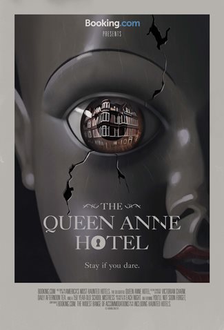
The grand prize of the best Halloween campaign 2013 has to go to the “Haunted”, the website from Booking.com. The brand, which offers more than 350,000 accommodations, picked the most haunted hotels from its list and accompanied them with individual horror stories and arty posters. The Stanley hotel from the “Shining” is included in the campaign, and it is a treat for the movie fans.
By scrolling up, you will feel as if you are walking up the stairs of a creepy building. The music and flickering lights add to the atmosphere and lead you to room 410 where horrible things happen. All well executed and tempting to click on the button reads “Stay if you dare”.

.jpg)
Let us know what you think of these campaigns in the comment & see Obergine interactive Halloween infographic from last year here